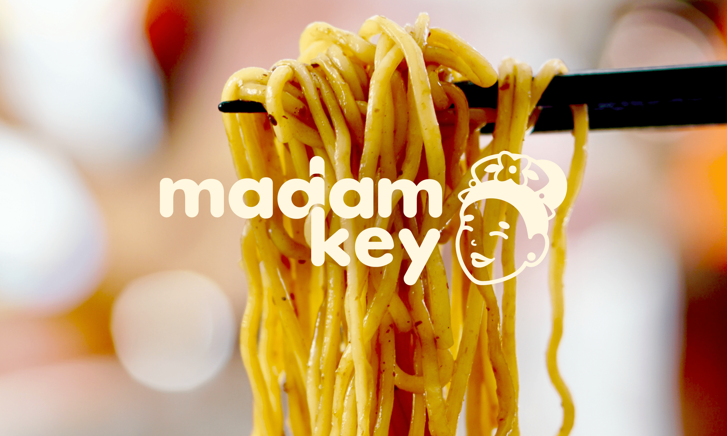
Madam Key
Brand Identity ⋆ Art Direction ⋆ Graphic Design
Year: 2023
Organisation: Jen Li Wan
Blurb: A freelance branding project for Madam Key, a Singapore-based food influencer and small-business owner on a mission to share the rich flavours of her hometown, Ipoh, with the world. What began as selling noodles from home has evolved into a culinary journey—now, as a chef, she hosts pop-ups across Singapore, Paris, and beyond, redefining traditional Malaysian cuisine and making waves in the food scene.
The Brief & The Goal
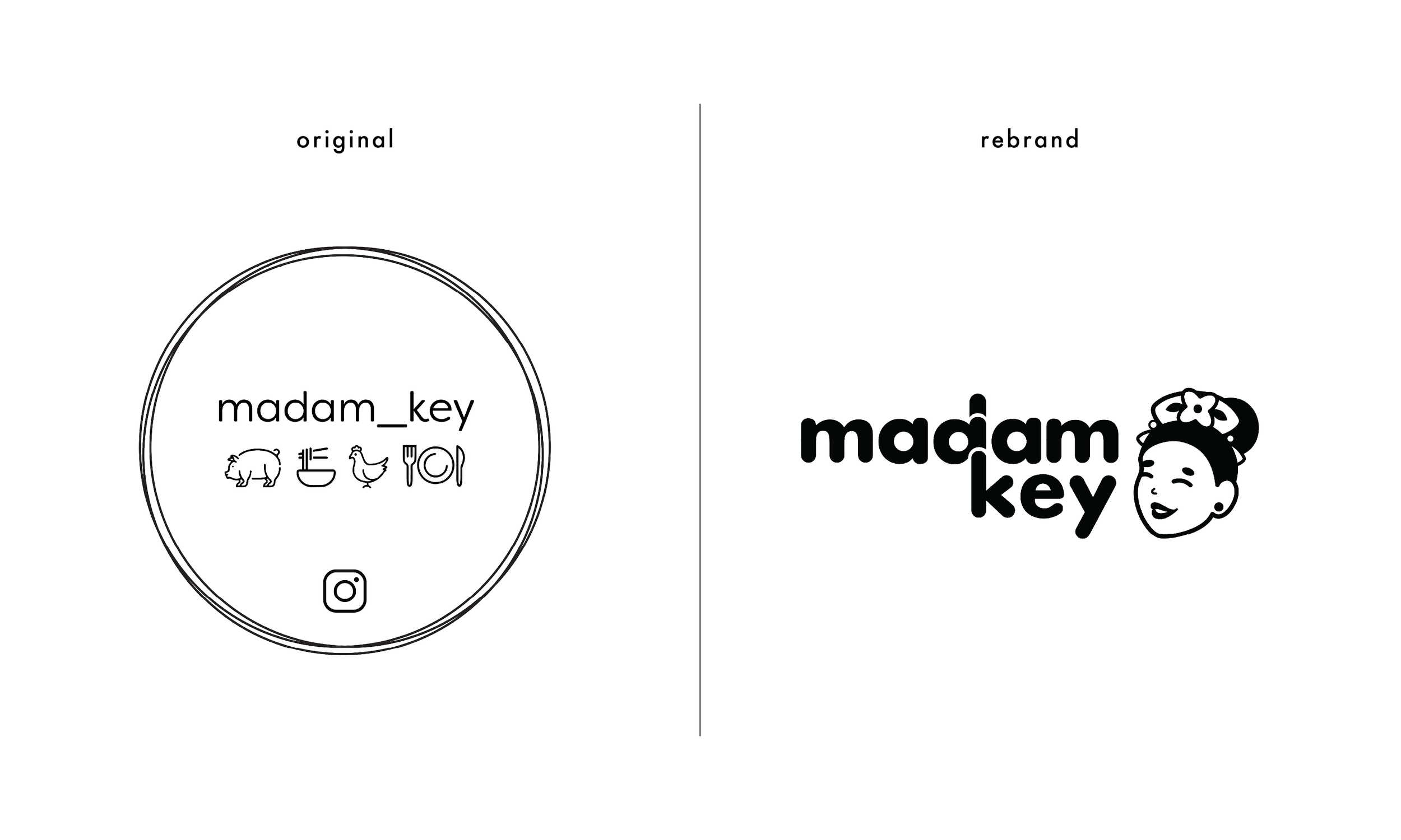
Madam Key approached me with the intention of spicing up the simple lockup she has for her home-cooking business. She had a clear vision of the impression she wanted her brand to leave—that being, bold, fun and a little sassy. Through conversation, we determined that the brand should champion her persona rather than a product range, given the chance that she may want to expand her menu or brand beyond just home-cooking. We also recognised that her personality and connection to her followers are the primary reasons for her success as business-owner ~ whereby, she is not just a cook, but a figure that the people of Singapore adored. So, my goal going into this project was to develop a brand which was as playful as it was versatile, and one which excited her and her community.
The Idea & The Magic
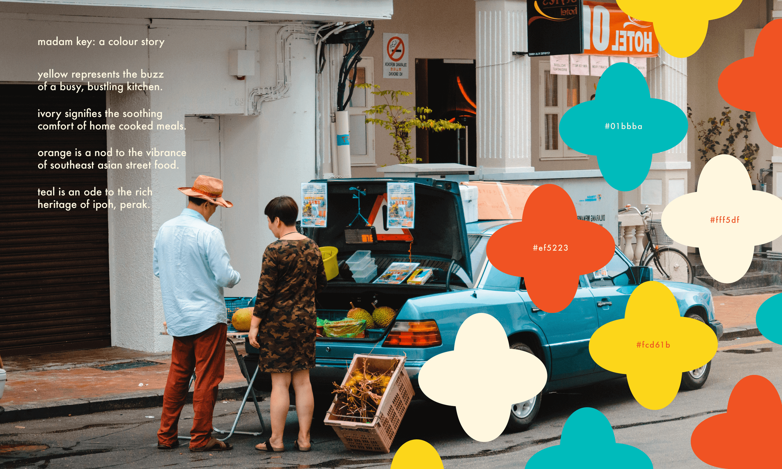
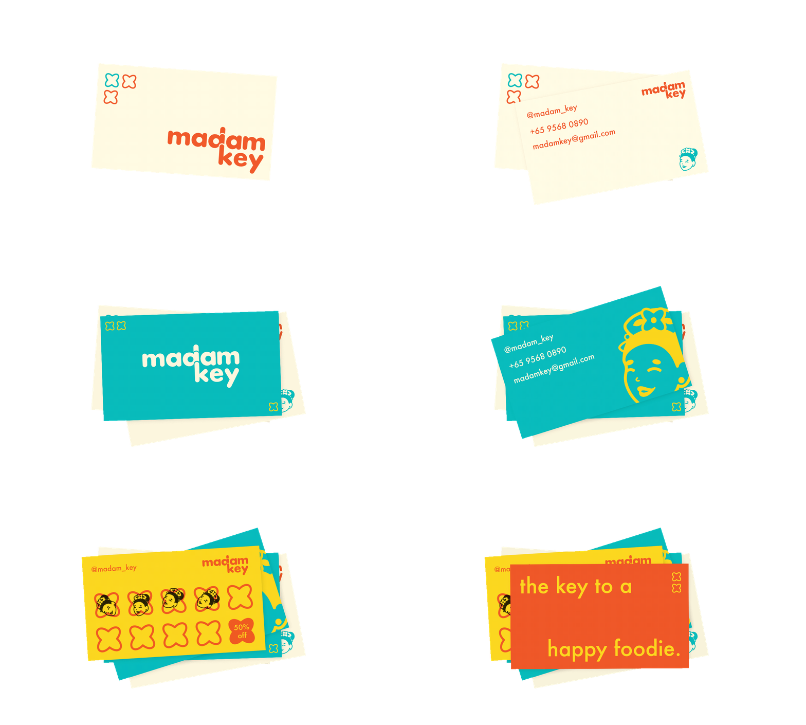
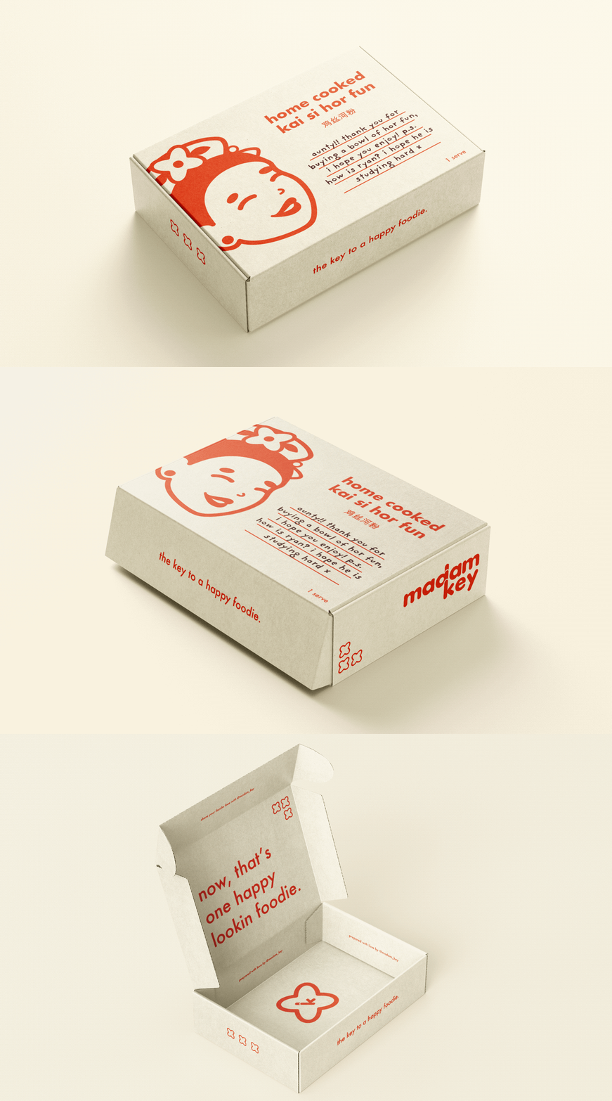
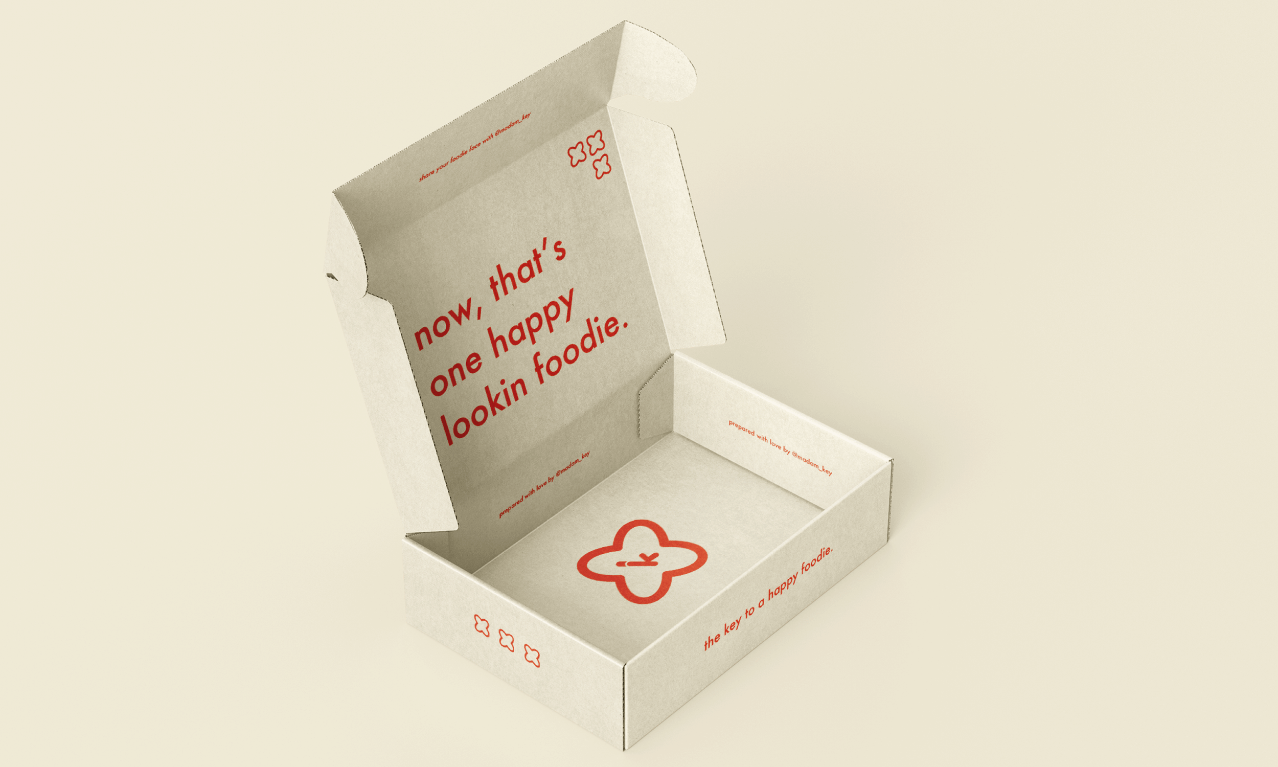
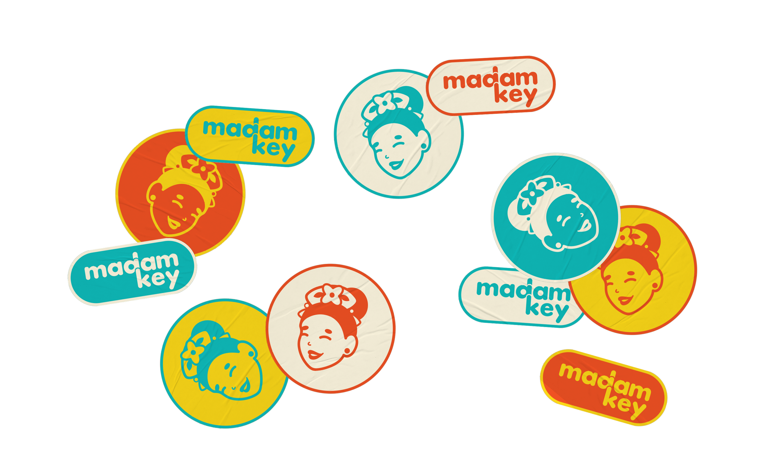
The final brand identity leans into the cheeky energy Madam Key was after by using a vibrant colour palette and bubbly, rounded forms throughout its visual system. The icon is a stylised representation of her in traditional Chinese dress to capture her roots as a Malaysian-born, Singaporean-local food-fanatic. The other visual motifs used throughout the brand’s art direction either reference her brand position (the key to a happy foodie) or a sense of sharing of home-grown, locally-loved dishes (flower emblems). Emphasising these brand messages as opposed to using stereotypical food-based visuals creates a point-of-difference from her local competitors and pairs well with the timelessness of the simple sans-serif typeface—warranting longevity for her brand and versatility for her growing business.
